
Responsive web design is a concept that's key in today's digital landscape. With a myriad of devices available, each with different screen sizes and resolutions, it's essential for a website to adapt and provide an optimal user experience, no matter the device. In this article, we explore responsive web design examples that demonstrate best practices and highlight the importance of adaptability in web design.
What is Responsive Web Design?
Before we delve into examples, let's first understand what responsive web design is. It's a design approach aimed at crafting sites that offer an optimal viewing and interaction experience—easy reading and navigation with minimal resizing, panning, and scrolling—across a wide range of devices, from desktop computer monitors to mobile phones.
Key Features of Responsive Web Design
Responsive web design is characterized by three main features:
- Media Queries: These allow developers to alter the layout of a site based on the properties of the user's device, offering more tailored experiences.
- Fluid Grids: These enable the site's columns to automatically rearrange themselves to fit the size of the screen or browser window, ensuring a consistent look and feel across multiple devices.
- Flexible Visuals: This feature ensures that rich media files, such as images and videos, do not exceed their containers' dimensions, thus creating a more adaptive user experience.
Now that we have a grasp of the concept, let's explore some powerful responsive web design examples.
Responsive Web Design Examples
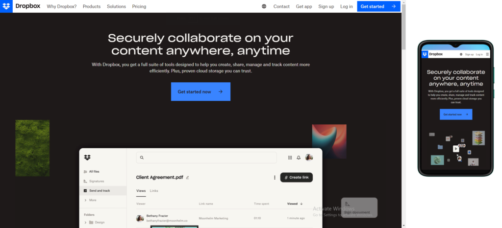
1. Dropbox
Dropbox's website offers a seamless experience across all devices. The site's layout changes from a multi-column format on desktop to a single-column layout on mobile and tablet devices. The visual elements are also flexible, ensuring they display correctly regardless of the device used. Dropbox has been known for a streamlined and user-friendly website design. The platform places emphasis on simplicity and accessibility, ensuring that users can easily navigate through their cloud storage services.
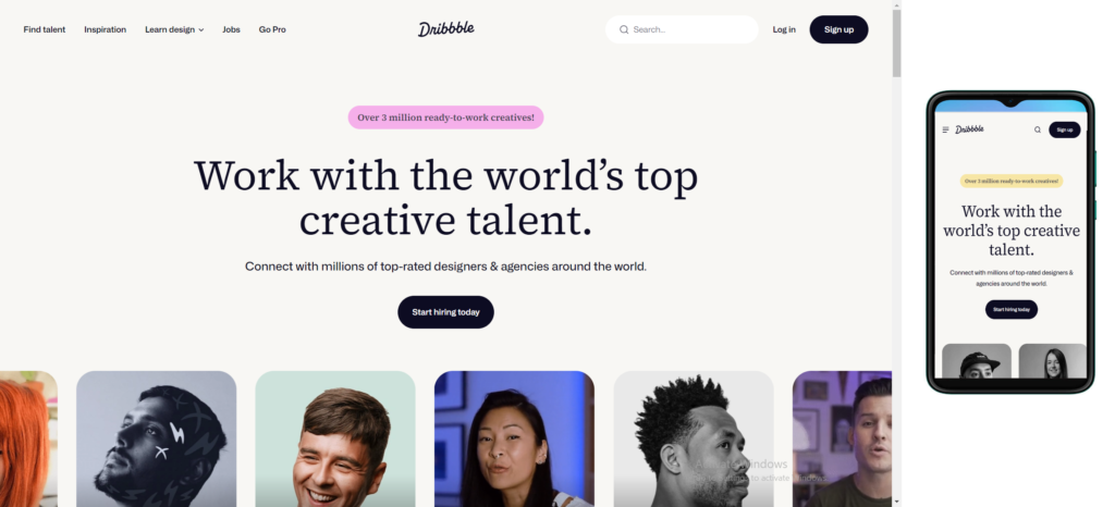
2. Dribbble
Dribbble's website features a flexible grid and fluid visuals that maintain the site's aesthetic across different devices. The navigation and user interface elements are simplified on mobile devices, making the site easy to use on smaller screens. Dribbble, a popular platform for designers to showcase their work, has been characterized by a visually engaging and creative website design. Known for its emphasis on showcasing design projects and fostering a vibrant community, Dribbble's website design typically incorporates modern aesthetics with a focus on visual elements. The platform's homepage often features a dynamic feed of design shots, encouraging exploration and inspiration. Intuitive navigation and user-friendly interfaces are common traits, aligning with the design-centric nature of the platform itself.
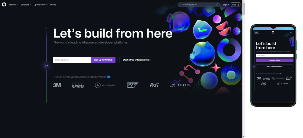
3. GitHub
GitHub offers a consistent user experience across all devices. The site's layout and content adapt based on the screen size, ensuring users can easily navigate and interact with the site on any device. GitHub, a leading platform for version control and collaboration on software development projects, is recognized for its clean and functional website design. The GitHub website features a well-organized layout that prioritizes easy navigation and efficient access to repositories, issues, and collaboration tools. The use of a minimalist design approach allows users to focus on content, code, and collaboration without unnecessary distractions. GitHub's design incorporates a professional aesthetic, reflecting its importance in the global developer community.
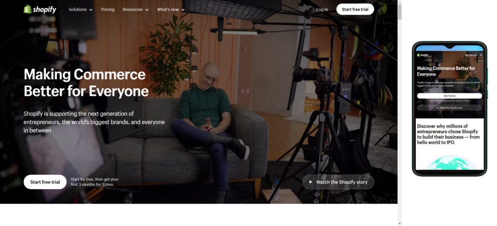
4. Shopify
Shopify's site provides a consistent, yet tailored, experience across every device. The site maintains its clear, bold call-to-action on all platforms, ensuring users can easily start a free trial or log in, regardless of the device they're using. Shopify, an e-commerce platform, is known for its sleek and user-friendly website design. The Shopify website design typically reflects the company's commitment to simplicity and efficiency in online store management. The homepage often features a clean layout with intuitive navigation, guiding users to explore various e-commerce solutions and features. Clear calls-to-action and a modern aesthetic contribute to a positive user experience. The design focuses on conveying the platform's capabilities, making it easy for merchants to understand how to set up and customize their online stores.
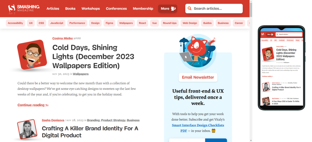
5. Smashing Magazine
Smashing Magazine's site is a great example of a responsive web design that focuses on content. The site adapts its layout and typography based on the device, ensuring users can comfortably read and interact with the content. Smashing Magazine's website design is a testament to its commitment to quality content and user experience within the web design and development community. Known for its expertise and valuable resources, the Smashing Magazine website typically exhibits a clean and well-organized layout. The homepage often features a mix of informative articles, tutorials, and the latest industry trends. The design embraces a modern and visually engaging aesthetic, complemented by an intuitive navigation system that facilitates easy exploration of their extensive content library. With a focus on usability and accessibility, the website design aligns seamlessly with the publication's mission to provide valuable insights and practical guidance for web professionals.
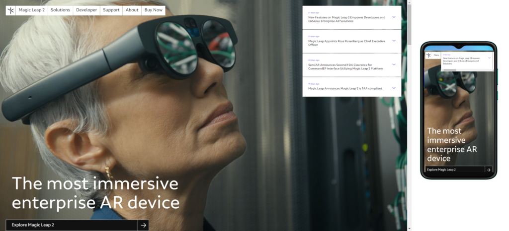
6. Magic Leap
Magic Leap's site leverages responsive design to create an engaging, interactive experience across all devices. The site uses flexible visuals and fluid grids to ensure the site's dynamic animations and vibrant colors display correctly on all devices. Magic Leap, a company specializing in augmented reality (AR) technology, often showcases a website design that mirrors the innovative nature of its products. Magic Leap's website typically incorporates a futuristic and visually striking layout, reflecting the cutting-edge advancements in augmented reality. The design often features immersive visuals and interactive elements, providing visitors with a glimpse into the possibilities offered by Magic Leap's AR technology. The website prioritizes clear communication about the company's vision, products, and applications of their technology.
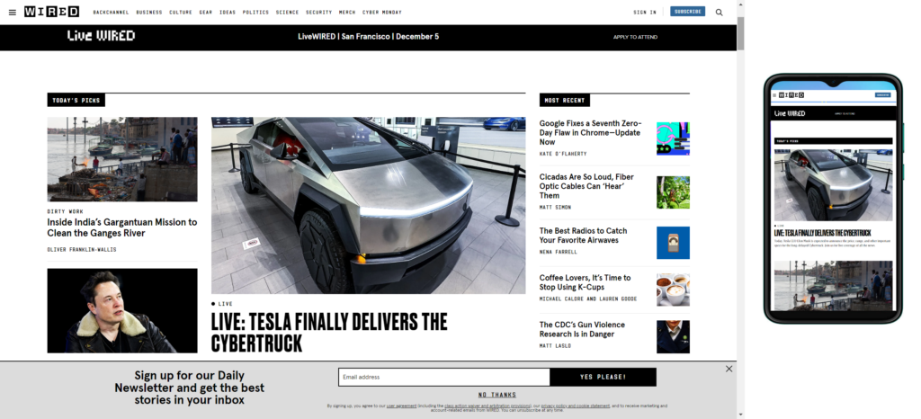
7. Wired
Wired's site focuses on delivering a consistent user experience across all devices. The site prioritizes content and uses flexible visuals to ensure articles and images display correctly on different devices for a seamless reading experience. Wired's website design embodies the tech-savvy and forward-thinking ethos of the renowned technology and culture publication. Known for its insightful content on emerging technologies, science, and culture, Wired's website typically features a sleek and dynamic design. The homepage often presents a mix of engaging visuals, thought-provoking headlines, and a well-organized layout that facilitates easy navigation. The aesthetic aligns with the publication's modern and progressive identity, creating an immersive digital environment for readers interested in staying informed about the latest advancements in technology and culture.
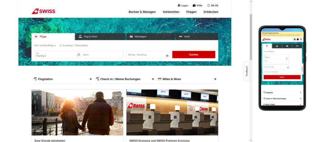
8. Swiss Air
Swiss Air's site is a great example of how to use responsive design to create a user-friendly booking experience. The site uses media queries and fluid grids to ensure users can easily navigate the site and book flights, regardless of their device. Swissair, being a prominent Swiss airline, has often emphasized a clean, user-friendly, and professional website design. Swiss companies, in general, tend to value simplicity and precision in their designs. The Swissair website likely prioritizes intuitive navigation, clear information on flights, services, and a visually appealing layout that aligns with Swiss design principles.

9. Really Interactive
Really Interactive's site is a prime example of how to use responsive design to create engaging, interactive experiences across all devices. The site maintains its dynamic animations and vibrant colors on all devices, ensuring users have a consistent, immersive experience. Really Interactive's website design is a perfect example of a user-friendly interface combined with an aesthetically pleasing layout. Their use of clean lines, beautiful animations, and a harmonious color palette creates a visually stunning first impression.
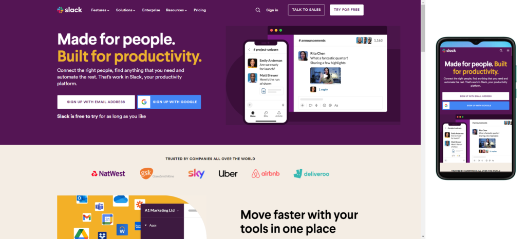
10. Slack
Slack's site provides a consistent, yet tailored, experience across every device. The site maintains its clear, bold call-to-action on all platforms, ensuring users can easily start a free trial or log in, regardless of the device they're using. Slack's website design is a testament to simplicity and efficiency, aligning with the platform's focus on seamless communication and collaboration. Characterized by a clean and modern aesthetic, the website typically features a straightforward layout that guides visitors through the platform's key features and benefits. The use of clear visuals and concise messaging contributes to an intuitive user experience, emphasizing the platform's capacity to streamline workplace communication. The design often employs a balanced combination of text and graphics, maintaining a professional yet approachable tone.
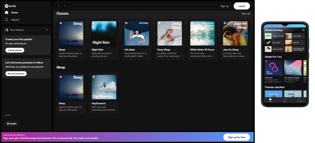
11. Spotify
Spotify's site focuses on delivering a consistent user experience across all devices. Spotify's website design reflects the music streaming platform's commitment to providing an immersive and user-friendly experience. Characterized by a sleek and minimalist layout, the website typically showcases vibrant visuals and engaging graphics that resonate with the dynamic nature of music. Intuitive navigation allows users to explore playlists, artists, and genres seamlessly. The design often incorporates a balance between showcasing the vast music library and simplifying the user journey, making it easy for visitors to discover, listen, and curate their favorite tracks effortlessly.
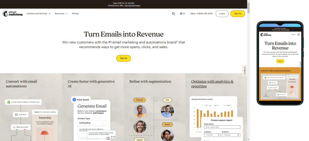
12. Mailchimp
Mailchimp's site uses responsive design to create an engaging, interactive experience across all devices. The site maintains its dynamic look and vibrant colors on all devices, ensuring users have a consistent, immersive experience. MailChimp's website design exemplifies simplicity and functionality, aligning with its role as a popular email marketing platform. Characterized by a clean and user-friendly interface, the website typically features a straightforward layout that guides users through the platform's email marketing tools and services. The use of clear visuals and concise messaging emphasizes MailChimp's commitment to making email marketing accessible for businesses of all sizes. Intuitive navigation allows visitors to explore features, pricing, and resources seamlessly. The design often incorporates a friendly and approachable aesthetic, reflecting MailChimp's brand personality.
| Criteria | Responsive Website Design | Non-Responsive |
|---|---|---|
| Definition | Adapts to different screen sizes and devices, providing a consistent user experience. | Does not adapt to various screen sizes, leading to a potentially inconsistent user experience. |
| User Experience | Consistent user experience across devices, leading to higher user satisfaction. | User experience may vary significantly on different devices, potentially leading to frustration. |
| Mobile-Friendliness | Optimized for mobile devices, improving accessibility and usability on smartphones and tablets. | May have poor performance and usability on mobile devices. |
| SEO Performance | Google favors responsive design for search rankings as it provides a better user experience. | Non-responsive sites may have lower search engine rankings, especially on mobile searches. |
| Development Effort | Typically requires more effort upfront to create a flexible and responsive layout. | Development may be faster, but separate versions may be needed for different devices. |
| Maintenance | Easier to maintain as changes apply universally to all devices. | Requires more effort to update and maintain multiple versions for different devices. |
| Cost | Initial development cost may be higher, but long-term maintenance costs can be lower. | Initial development cost may be lower, but ongoing maintenance costs can add up. |
| Future-Proofing | Better future-proofing as the site can adapt to new devices and screen sizes. | Prone to becoming outdated as new devices with different screen sizes emerge. |
| Flexibility | Offers more design flexibility, adapting to a wide range of screen sizes seamlessly. | Limited design flexibility, with fixed layouts that may not work well on all devices. |
| Loading Speed | Generally better loading speed on mobile devices, improving overall performance. | May experience slower loading times on mobile devices due to non-optimized layouts. |
| User Engagement | Higher user engagement due to a positive and consistent experience across devices. | May face challenges in user engagement, particularly on devices where the site is not well-optimized. |
Conclusion
These responsive web design examples reflect the importance of adaptability in today's digital landscape. By crafting sites that offer an optimal viewing and interaction experience across a wide range of devices, businesses can ensure they meet their users' needs and expectations.
A well-executed responsive design can enhance user engagement, improve SEO rankings, and ultimately boost conversions. Therefore, as a web designer, it's essential to consider responsiveness when designing a website to provide the best possible user experience.
Remember, the goal of responsive design isn't just about making a website look good on different devices—it's about making it work well and feel right to the user, regardless of the device they're using.
FAQs
Q1: What is Responsive Web Design (RWD)?
A: Responsive Web Design is an approach to web design that makes web pages render well on a variety of devices and window or screen sizes. It ensures optimal viewing and interaction experiences across various platforms, from desktop computers to smartphones.
Q2: Why is Responsive Web Design important?
A: RWD is crucial as it caters to the diverse range of devices people use to access the internet. It enhances user experience by adapting the layout, images, and other elements of a website to match the specific device, leading to improved accessibility and user satisfaction.
Q3: How does Responsive Web Design work?
A: RWD employs flexible grids and layouts, along with CSS media queries, to adjust the design elements based on the characteristics of the device or screen size. This allows the content to dynamically adapt and provide an optimized user experience.
Q4: What are the key components of Responsive Web Design?
A: The main components include flexible grids, media queries, and flexible images. Flexible grids use relative units like percentages, media queries apply different styles based on device characteristics, and flexible images scale appropriately within their containers.
Q5: Is Responsive Web Design only for mobile devices?
A: No, Responsive Web Design is not limited to mobile devices. It encompasses a wide range of devices, including desktops, laptops, tablets, and smartphones. The goal is to create a seamless user experience across all screen sizes.
Q6: How does RWD impact SEO (Search Engine Optimization)?
A: Google recommends Responsive Web Design as it consolidates website content and improves user experience. Having a mobile-friendly site can positively impact SEO rankings, as search engines prioritize mobile-friendly websites in their results.
Q7: Can an existing website be converted into a responsive design?
A: Yes, existing websites can be converted to a responsive design through a redesign process. This often involves modifying the existing codebase, implementing responsive design principles, and testing across various devices to ensure compatibility.
Q8: Are there any drawbacks to Responsive Web Design?
A: While Responsive Web Design offers numerous benefits, challenges may include increased initial development time and potential complexity. Ensuring compatibility across various browsers and devices requires thorough testing to address any issues that may arise.
Q9: How can I test if my website is responsive?
A: You can test your website's responsiveness using various online tools like Google's Mobile-Friendly Test or browser developer tools. Additionally, manually resizing your browser window or using mobile emulators can help simulate different device screen sizes.
Q10: Is Responsive Web Design the same as Adaptive Web Design?
A: While both terms are related to creating a better user experience across devices, Responsive Web Design uses fluid grids and flexible layouts, whereas Adaptive Web Design adapts to specific breakpoints. Responsive design is a broader concept that covers a wider range of devices.